Church on the Rock Branding
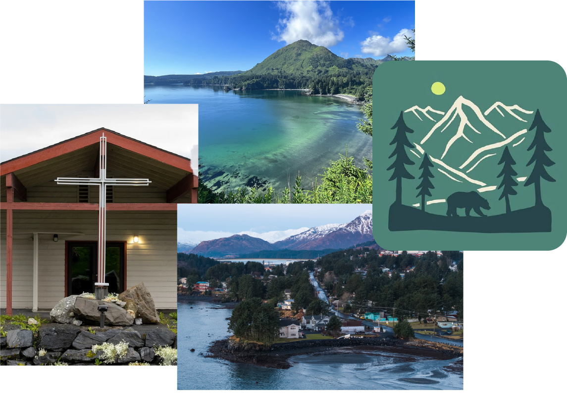
Church on the Rock has served the Kodiak, Alaska community for decades — a congregation rooted in place as much as faith. The project called for a brand identity that felt native to both: grounded in the church's history, shaped by the landscape surrounding it, and built to last across everything from bulletins to signage.
Roles
Branding
Logo Design
Typography
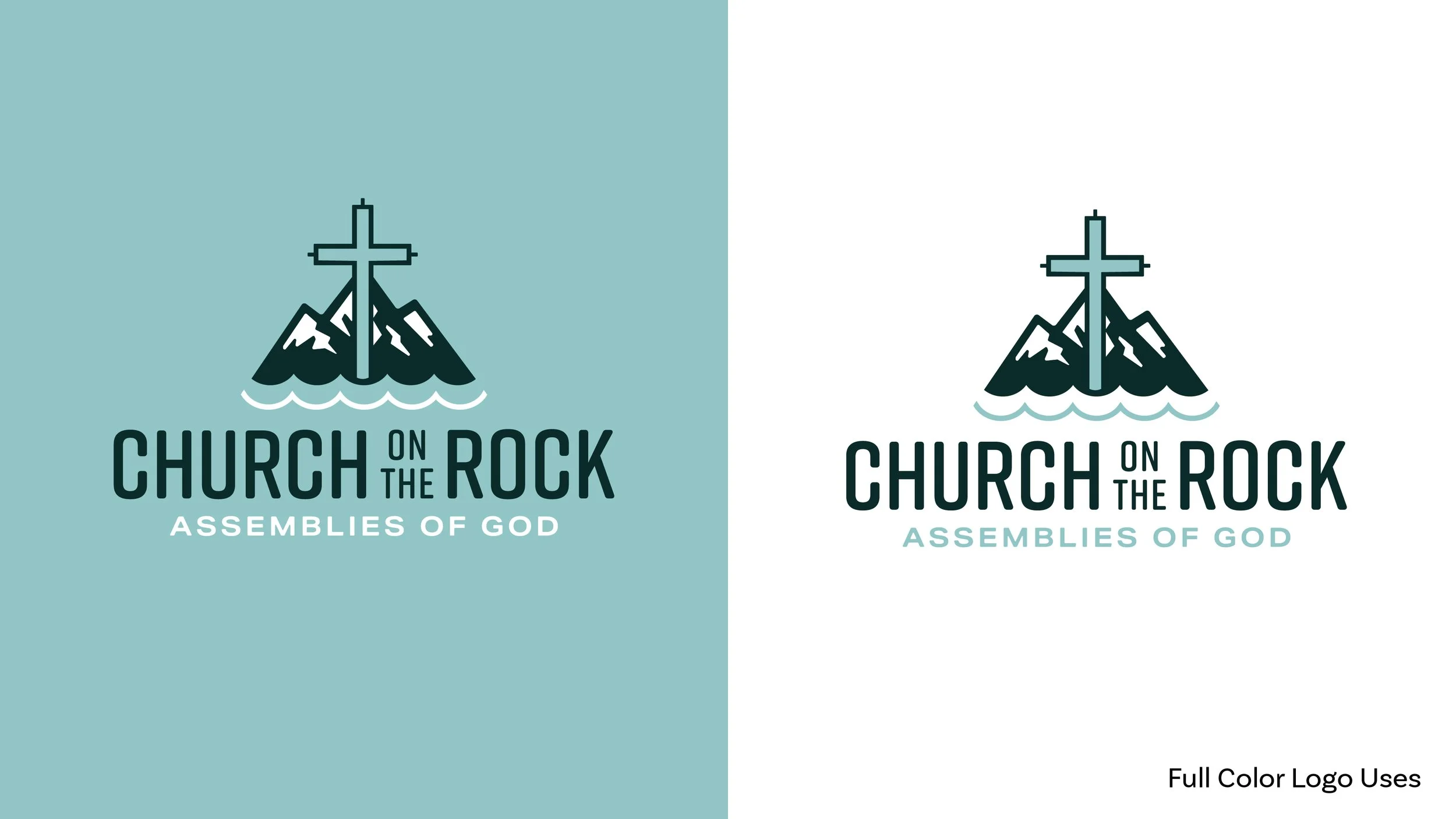
A Sense of Place
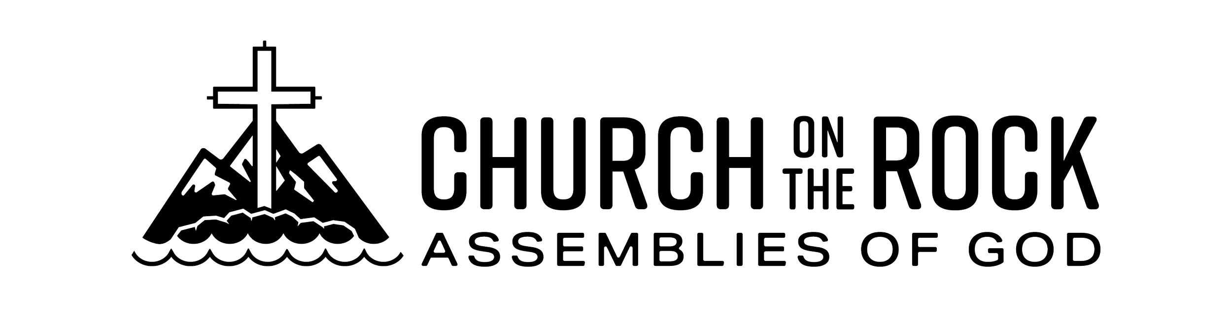
Inspired by the natural landscape of Kodiak, the identity needed to reflect the relationship between the church and its environment. Mountain forms and the surrounding waters echo the wilderness the congregation calls home, while the cross drawn from the structure in front of the building acts as a central, unifying symbol. Repeated as a motif, it ties the mark back to something real: the building where the congregation actually gathers.
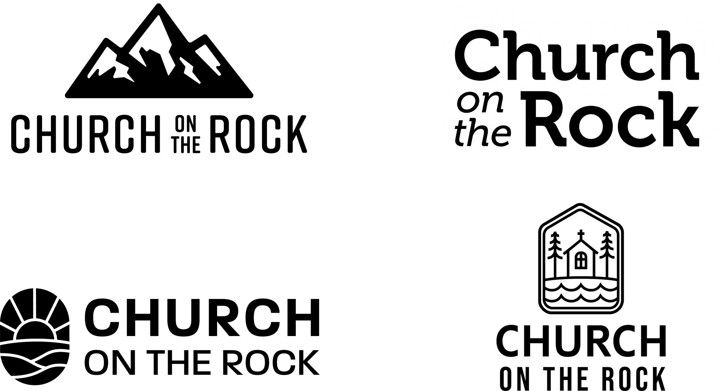
Initial Concepts
Four black-and-white concepts explored different directions — some leaning into the mountain landscape, others foregrounding the cross and architectural details of the building itself. Keeping this stage monochromatic kept the focus on form and meaning before color entered the conversation.
Refinement
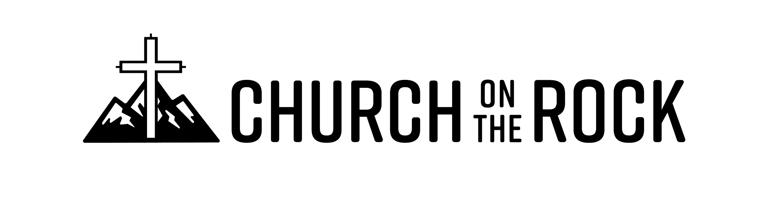
With a direction selected, the next step was finding the right balance. Each iteration added an element from the client's wishlist — a useful exercise in knowing when to stop.
Variation 1 The cross, pulled directly from the church's architecture, anchors the mark. Clean, immediate, and strong on its own.
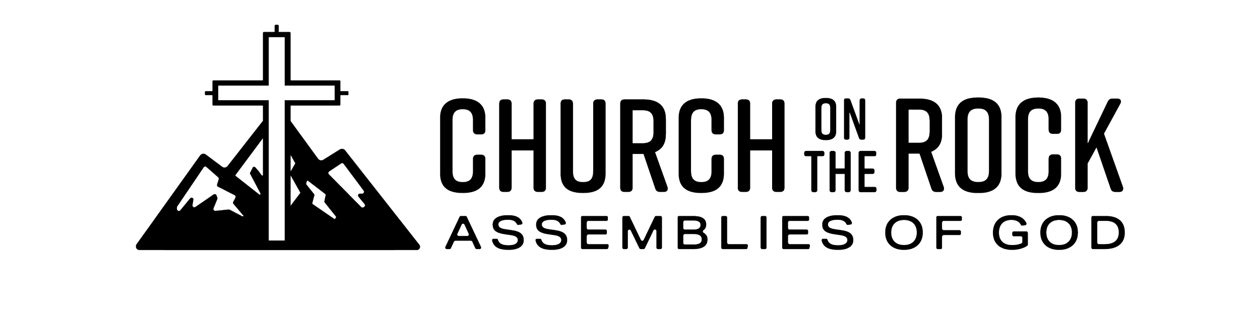
Variation 2 Adding the Assemblies of God denomination in secondary text roots the identity in its broader church affiliation without competing with the primary mark.
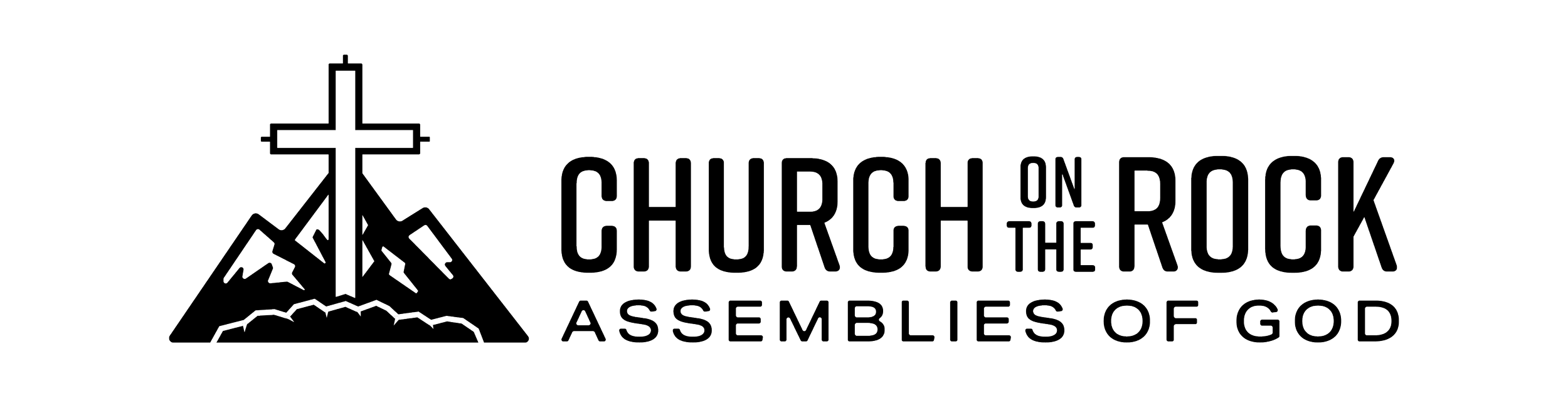
Variation 3 Rocks enter the composition, nodding the rocks that circle the church’s main cross. This was personally my Favorite
Variation 4 Water motif added. I enjoyed this design but I felt that the multiple elements begin to compete for attention. This was the client’s design choice.
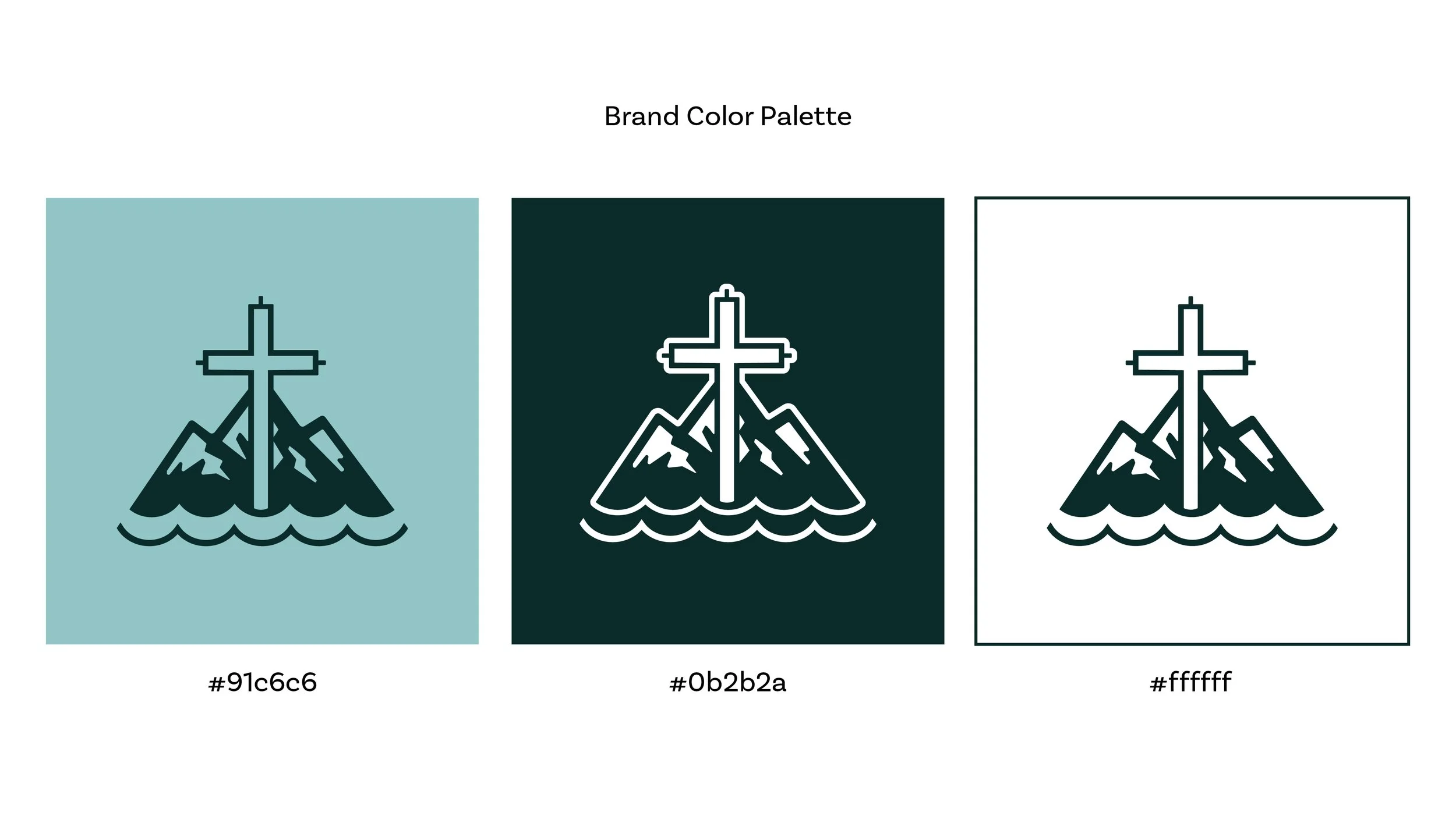
Color Palette
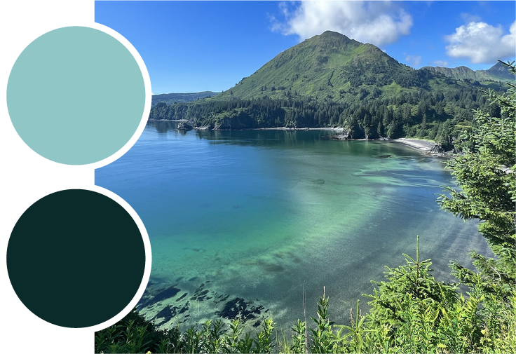
The approved mark then received a palette drawn from Kodiak itself — the steely blues of the surrounding water, the muted greens of the landscape, and the warmth of worn stone. Color wasn't added for decoration; it was chosen to make the identity feel native to where the church actually lives
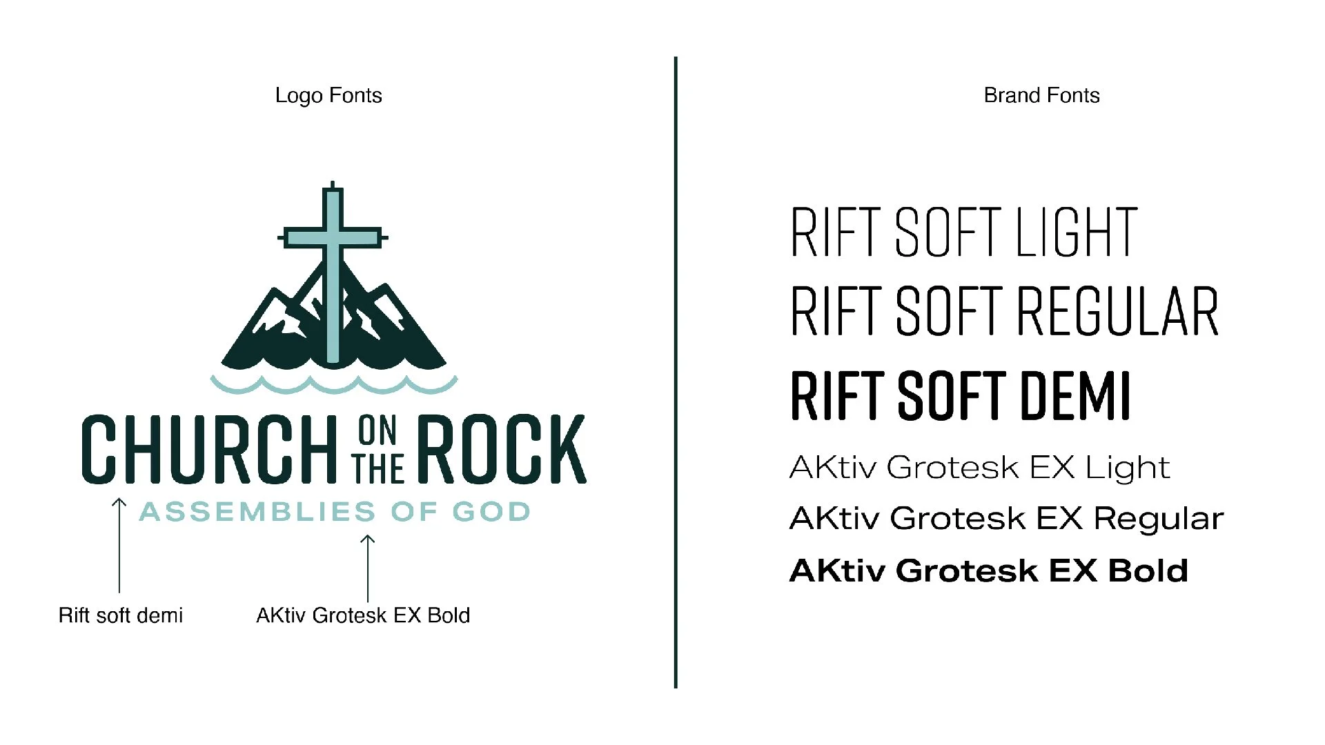
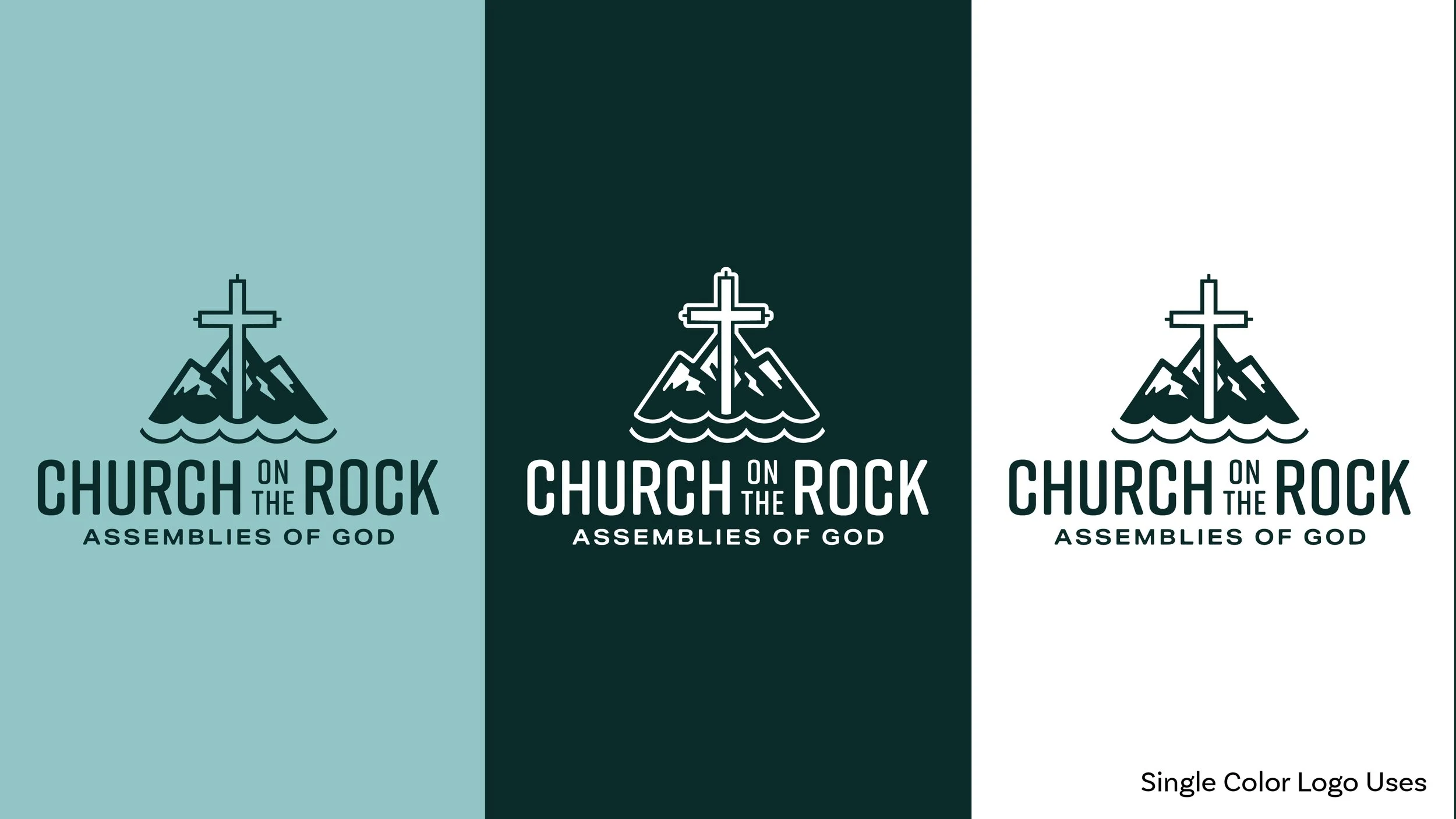
Typography
The typography system balances strength and approachability, pairing the geometric structure of Aktiv Grotesk with the softer, more expressive character of Rift Soft. Aktiv Grotesk provides clarity and versatility across applications, while Rift Soft adds warmth and personality to key moments. Together, they create a cohesive typographic voice that feels grounded, modern, and welcoming.

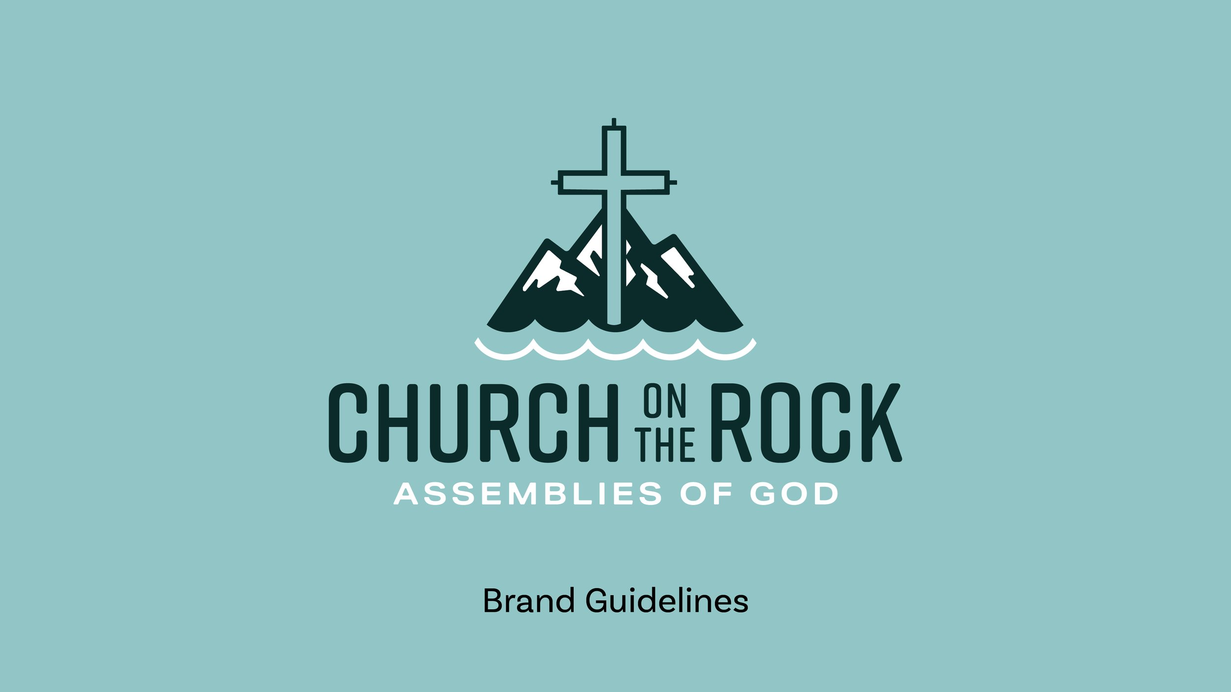
Brand Guide
The final deliverable brought everything together in a concise brand guide: logo usage, color palette, and typography — enough to give the church's team the tools to move forward consistently, without overcomplicating what they need to maintain.
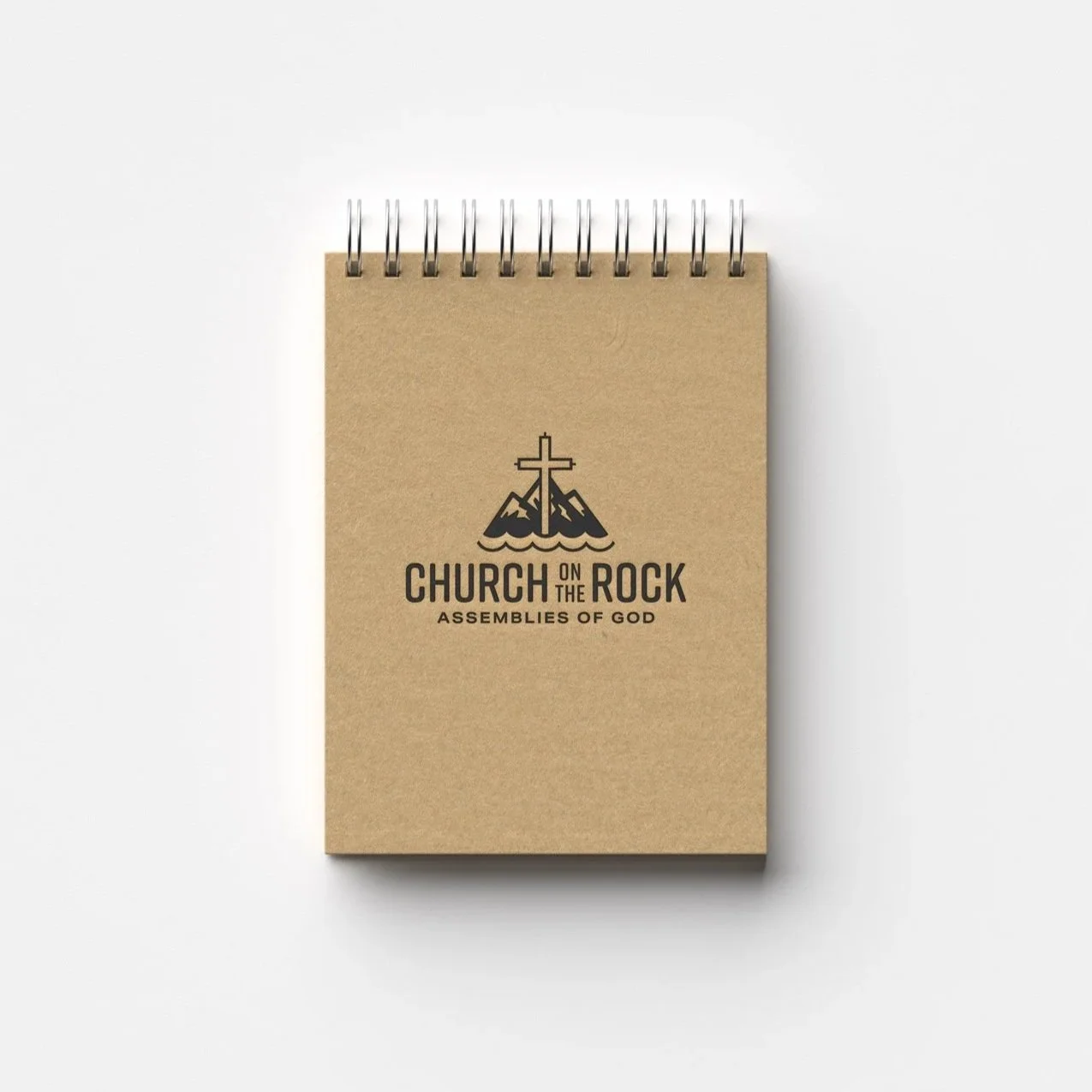
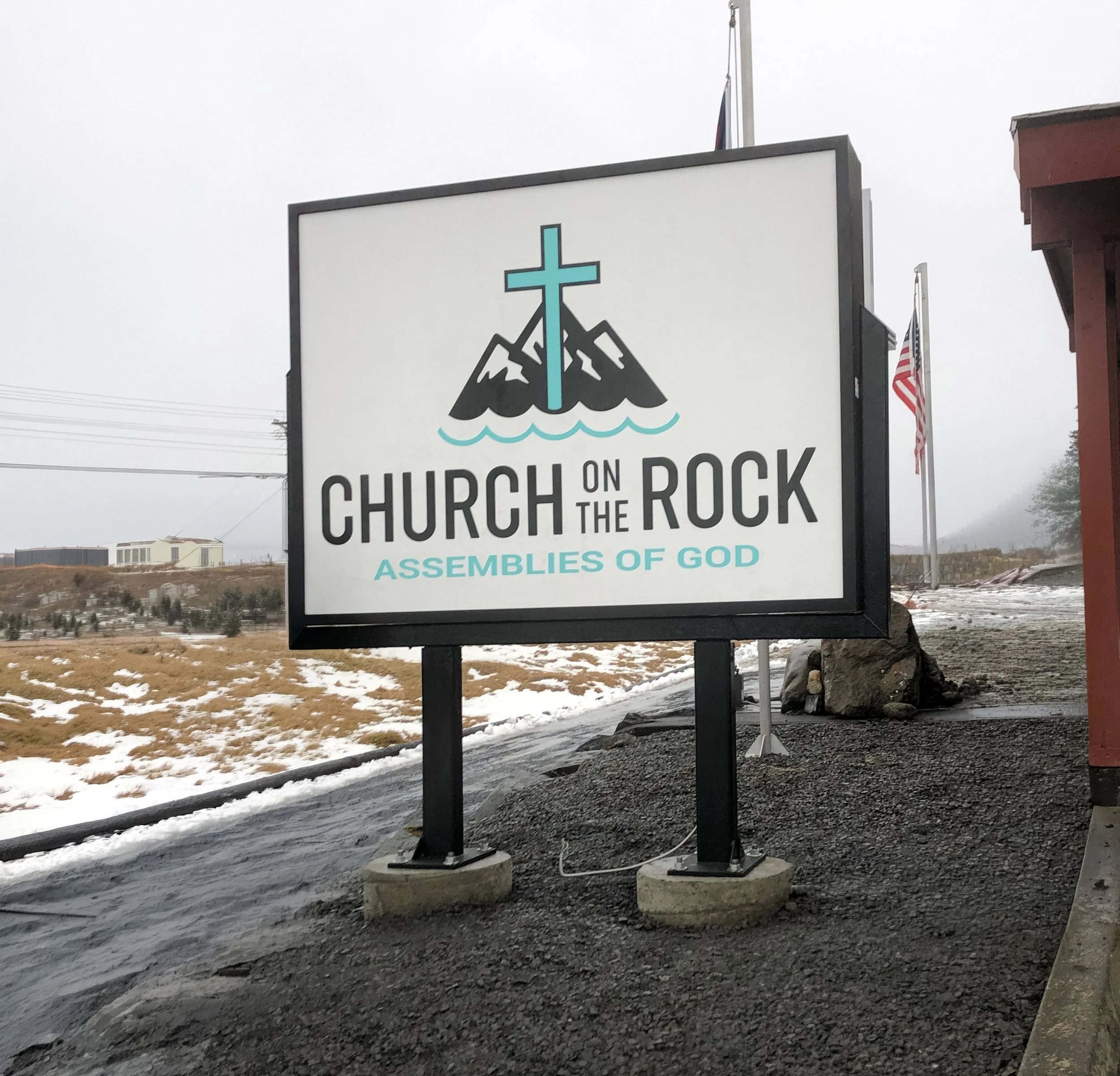
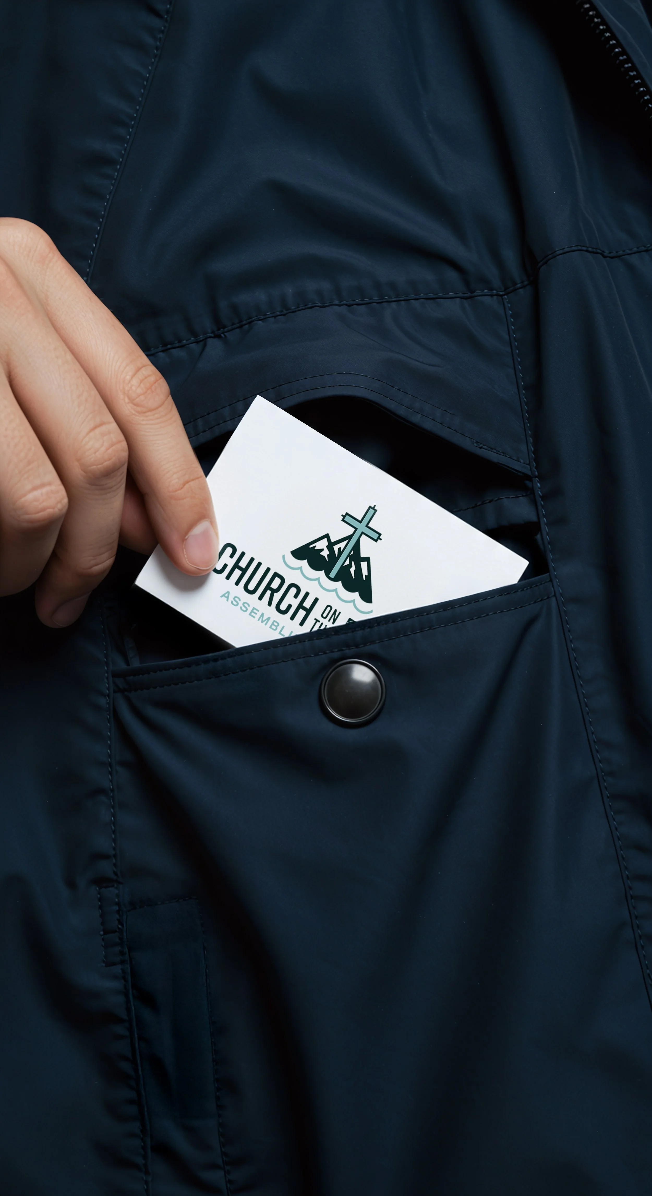
Final Results