
Parlae Vodka Rebrand
Parlae is a Portland vodka with a simple premise — supreme quality, locally made. This is the rebrand that finally made the bottle match the product: logo, identity system, and packaging from the ground up.
Roles
Branding
Logo Design
Packaging
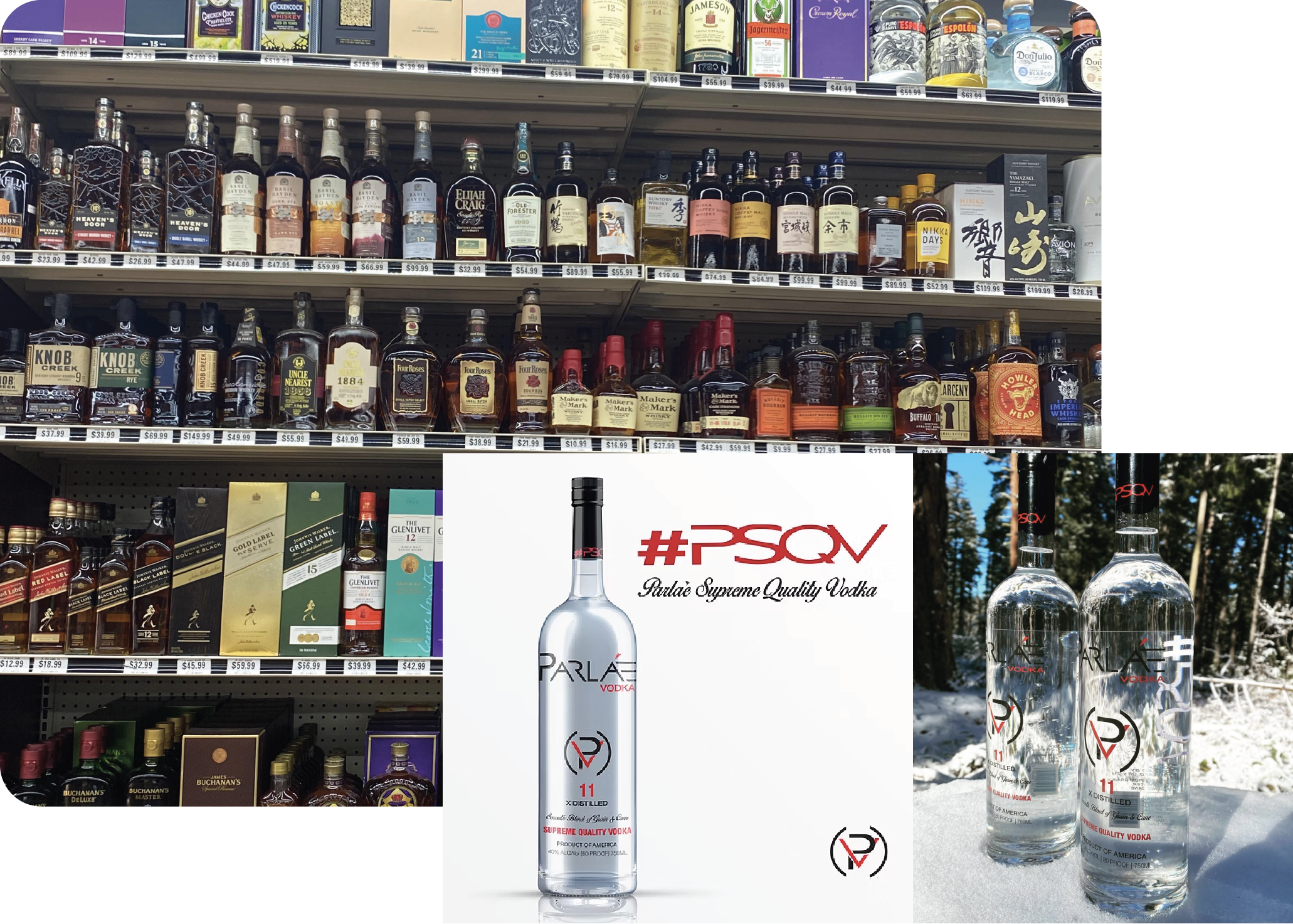
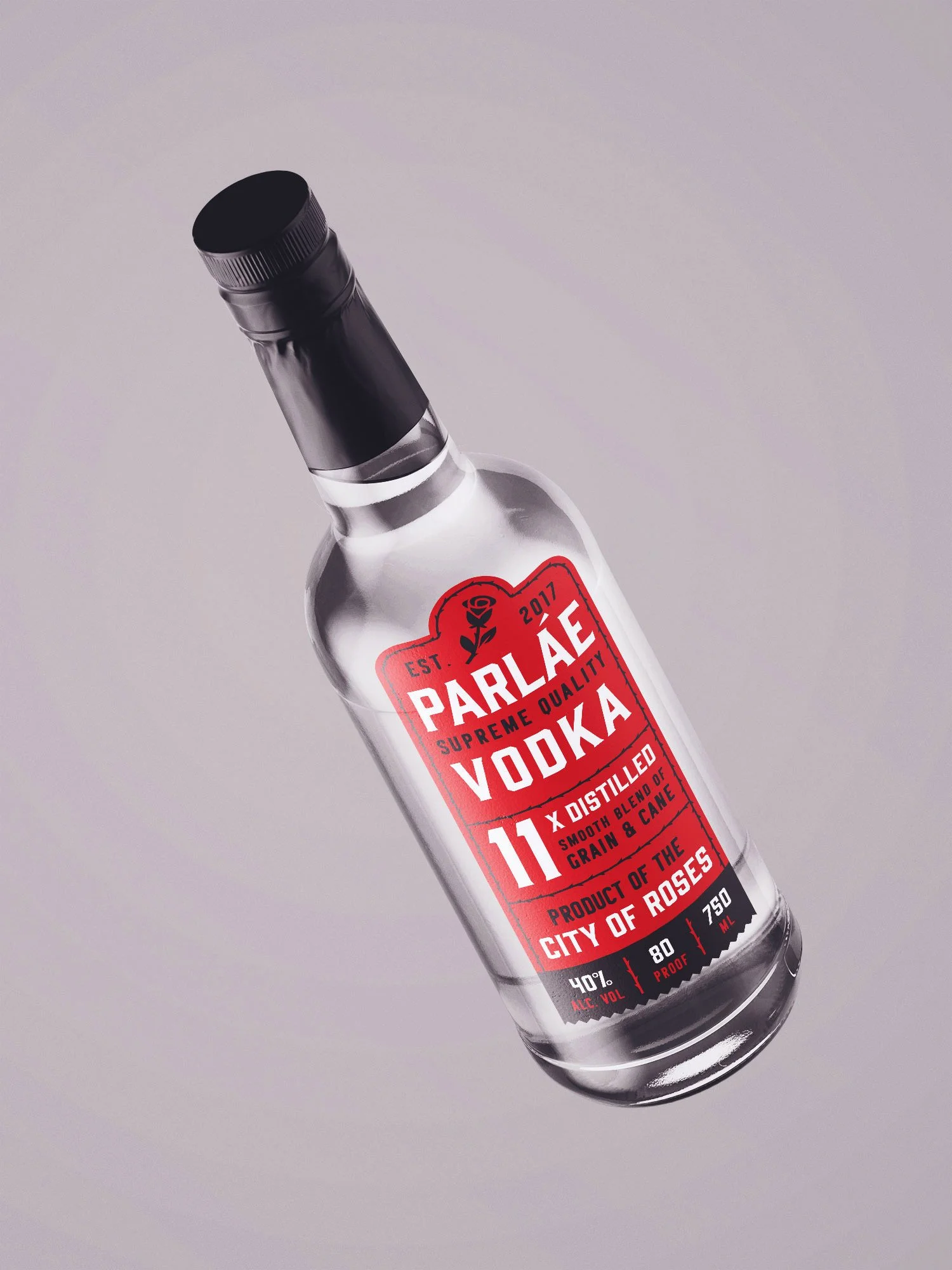
On a packed spirits shelf, Parlae was invisible. The existing label — light, transparent, with competing elements and nothing to grab onto. A monogram mark, script copy, and multiple brand claims all fought for space without any of them winning. In an aisle full of color and contrast, Parlae faded into the background. For a brand with real quality behind it, the packaging simply wasn't doing its job.
Problem
Inspiration
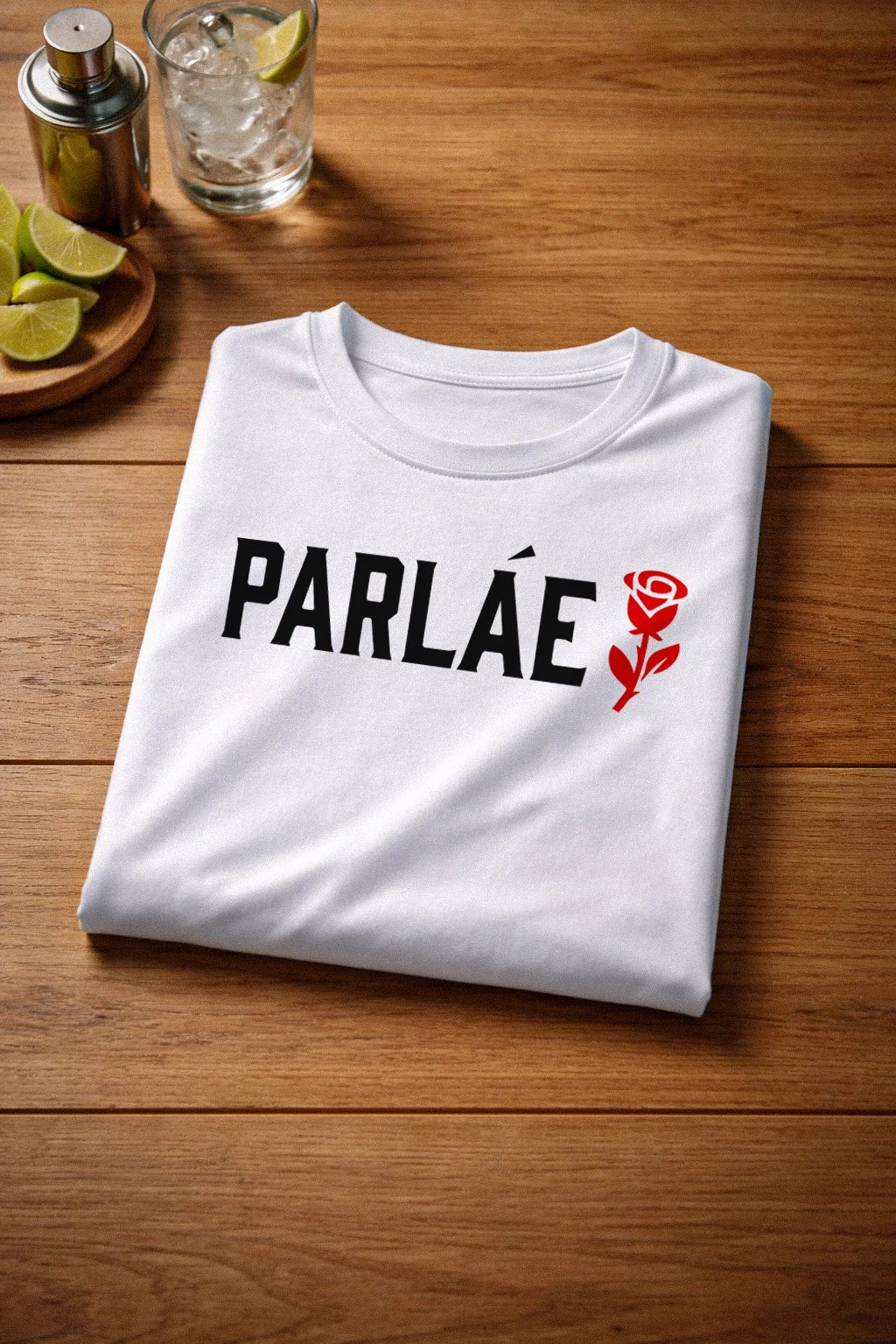
The starting point was bold, high-contrast packaging — the kind that reads clearly from across a store and sticks in your memory after you've walked past it. Parlae was locally made, so I wanted a design that gave Portland its flowers. Literally.
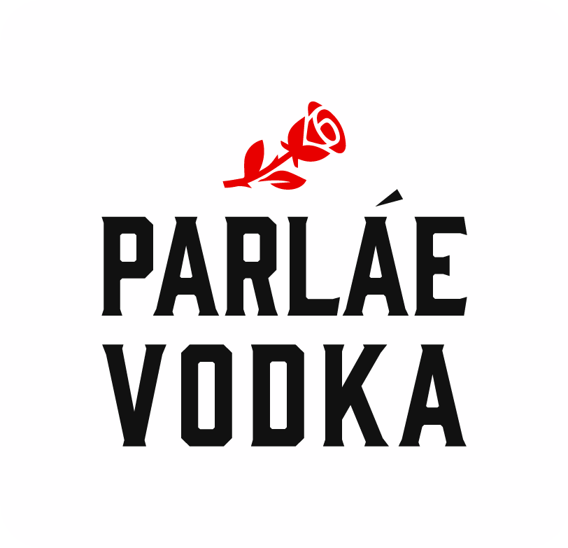
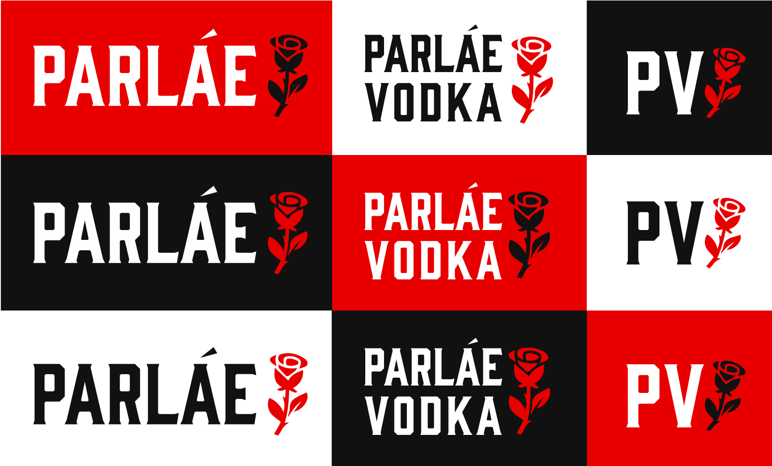
A big strength of Parlae is its focus on being local and high quality. I wanted to lean further into that by emphasizing its Portland roots—highlighting that it’s owned and made locally. To support this, I introduced a rose motif, referencing Portland’s identity as the “City of Roses.”
The existing red, black, and white color palette works perfectly within this direction. Red naturally ties to the rose concept, while also aligning with the visual language of local teams like the Portland Trail Blazers, reinforcing a strong, authentic Portland feel.
Brand Solution
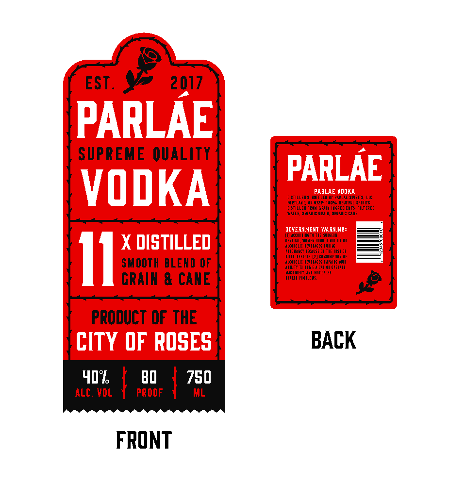
Updated Packaging
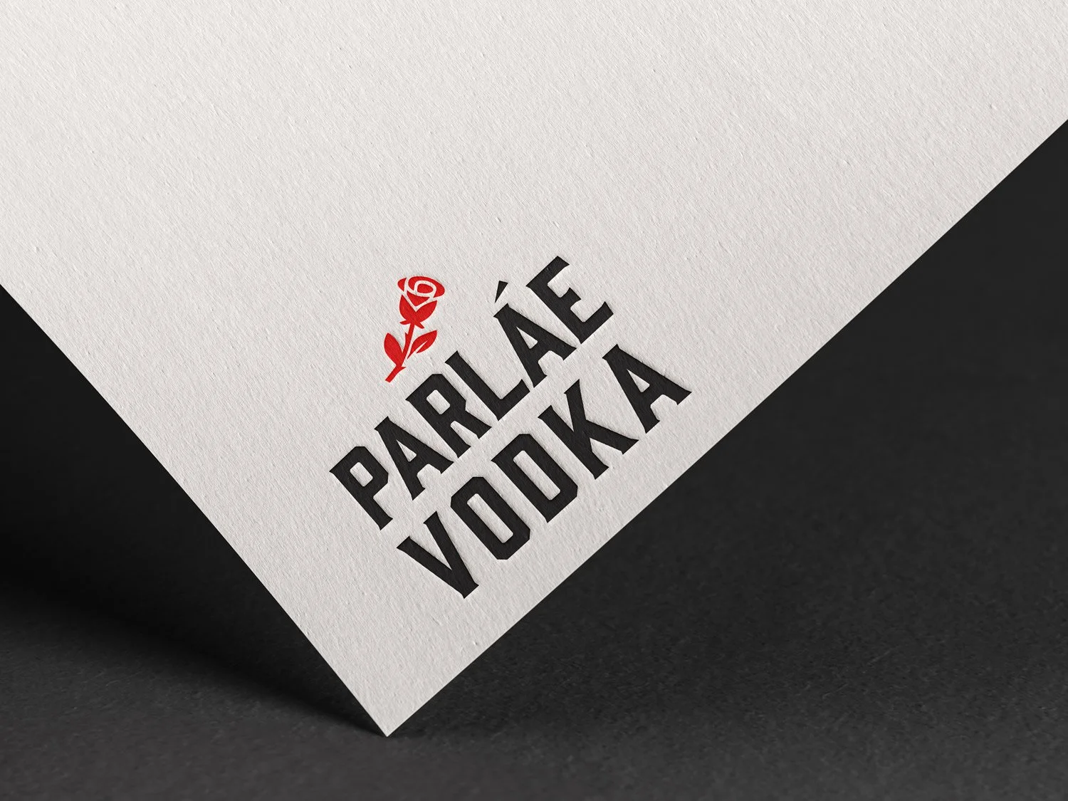
Where the original label tried to justify its premium positioning through copy and claims, the new system earns it through restraint. High contrast, clean hierarchy, the wordmark front and center with room to breathe.